WEST WORLD
TV Episodic | 1.1 Million views +
Forth Season | 8 Episodes
HBO
Credits
Showrunner: Jonathan Nolan + Lisa Joy
Production Designer: John Carlos
Senior Design Consultant: Jonathan Berube

The Role of Olympiad in Westworld’s Expanding Narrative
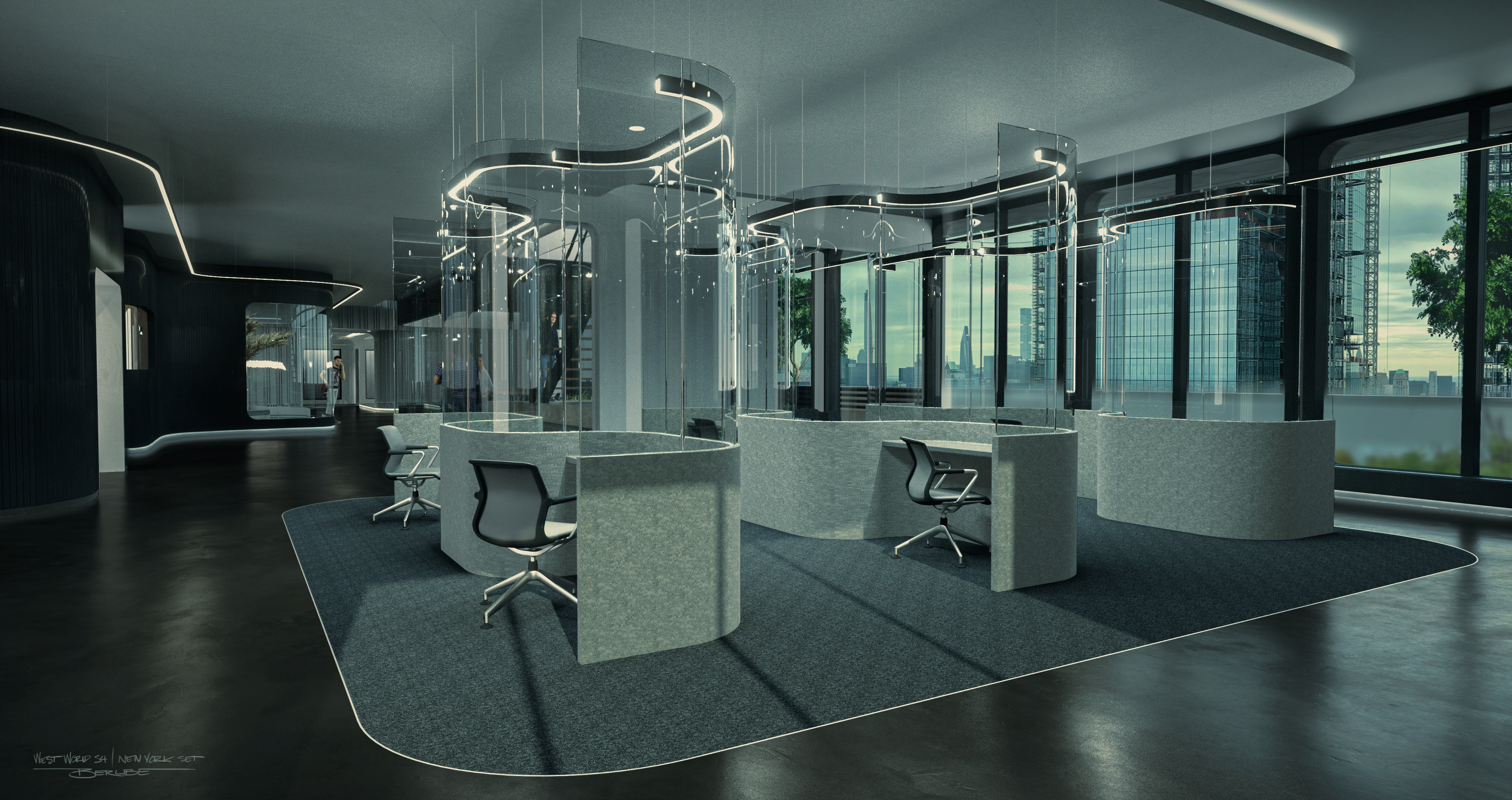
Olympiad Entertainment isn't just a backdrop; it plays a critical role in the unfolding story of Westworld Season 4. Christina’s discovery of the true impact of her work at Olympiad marks a pivotal point in the season. As she begins to understand that the characters she writes are, in fact, living people, the set becomes a character in its own right—a space where reality and fiction intertwine, and where the boundaries of free will are constantly tested. Hale’s manipulation of Olympiad, using it as a tool for her mind-control experiments, adds another layer of complexity. The sterile, oppressive environment of the Olympiad offices is a perfect visual metaphor for the control that Hale exerts over both humans and hosts alike. It’s within these walls that the new world order is crafted, making Olympiad Entertainment not just a company, but a symbol of the overarching theme of domination in Westworld.
Where Stories Shape Reality
Olympiad Entertainment makes its debut in the very first episode of Season 4. We are introduced to Christina, a character with a striking resemblance to the original Dolores, who now works as a writer for Olympiad. The company is more than just a gaming studio—it’s a place where narratives crafted by Christina don’t just stay within the virtual realm; they have real-world consequences. The seamless transition between Christina’s fictional creations and the reality of the world around her blurs the lines between creator and creation, echoing Westworld's ongoing themes.


Designing a Set That Reflects Olympiad’s Dark Purpose
The challenge in designing the Olympiad Entertainment offices was to create a space that not only looked sophisticated and minimalist but also subtly hinted at the darker undertones of its operations. The set had to evoke a sense of sterile, clinical control—an environment where creativity is harnessed for manipulation rather than expression. To achieve this, we leaned heavily on "hard" materials like sleek epoxy, stainless steel, and glass. These materials, with their reflective surfaces, create a cold, almost dehumanizing atmosphere, perfectly mirroring the sinister nature of Olympiad’s work. The high contrast in tones throughout the set further emphasizes a binary, black-and-white worldview, akin to the rigid loops that once governed the hosts of Westworld. This design was a blend of practical builds and VFX set extensions, ensuring that the physical environment seamlessly integrated with the digital effects, making the set both a believable workspace and a symbolic representation of the show's themes

The Design of Olympiad Entertainment
Westworld has always been a universe where the line between humanity and technology is blurred, often with unsettling consequences. From Delos to Incite, the series has introduced us to a string of shadowy corporations with a penchant for controlling the human mind. In Season 4, Olympiad Entertainment enters this nefarious lineup, not just as another corporate player, but as a crucial element in the series' exploration of free will and control.

Designing the 1920s Chicago Set for Westworld Season 4
In Westworld Season 4, the introduction of an amusement park modeled after 1920s Chicago added a layer of nostalgia and complexity to the show’s dystopian narrative. The setting, with its iconic architecture and aesthetic, was essential in drawing parallels between the Roaring Twenties—a time of great social and technological upheaval—and the show's futuristic themes of control, rebellion, and human nature. When designing this location, our goal was to recreate the look and feel of Chicago in the 1920s, while subtly incorporating the undertones of Westworld’s larger narrative. The challenge was not only in replicating historical accuracy but also in embedding thematic elements that echo the show's exploration of control and rebellion.
(Right) Melody Ranch in its original state, which served as the foundation for the “Chicago Amusement Park” set.

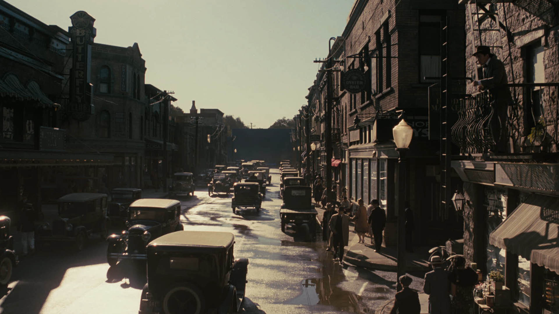
(Left) The final shot as it appeared in episode 6 of the 4th season. The extras effectively populate the street, adding a sense of life and scale to the scene. Notice how the color grading enhances the period-accurate look, evoking the appearance of older film stock and emulsion processes, further immersing the audience in the 1940s setting.

Blending History and Futurism
In creating this set, we focused on the contrast between the era’s glamour and the darker undercurrents of its history. The 1920s was a time of glitz, jazz, and opulence, but also one of growing social tensions and organized crime. To reflect this, the set design featured ornate, Art Deco elements alongside more subdued, gritty touches to give it an authentic yet slightly exaggerated feel—perfect for Westworld's version of reality. We leaned heavily on the use of period-specific materials like polished wood, brass, and marble, while ensuring that the set didn’t just feel like a museum piece. It needed to be immersive and functional within the larger Westworld universe, blending practical builds with digital extensions. This marriage between practical design and VFX helped achieve the illusion of a grand 1920s cityscape.


Thematic Parallels
The 1920s Chicago set serves as more than just a backdrop; it embodies the thematic elements of control, facade, and illusion central to Season 4. The lavish buildings and bustling streets represent the allure of freedom and opportunity—a stark contrast to the reality beneath the surface, where human lives are still under control, dictated by carefully crafted narratives. This duality mirrors the larger plot of the season, where characters like Christina grapple with the truth of their existence, much like the city itself hides its dark underbelly beneath a veneer of prosperity. The set design was integral in visually conveying this dual nature, making it not just a setting, but a crucial part of the storytelling.




(
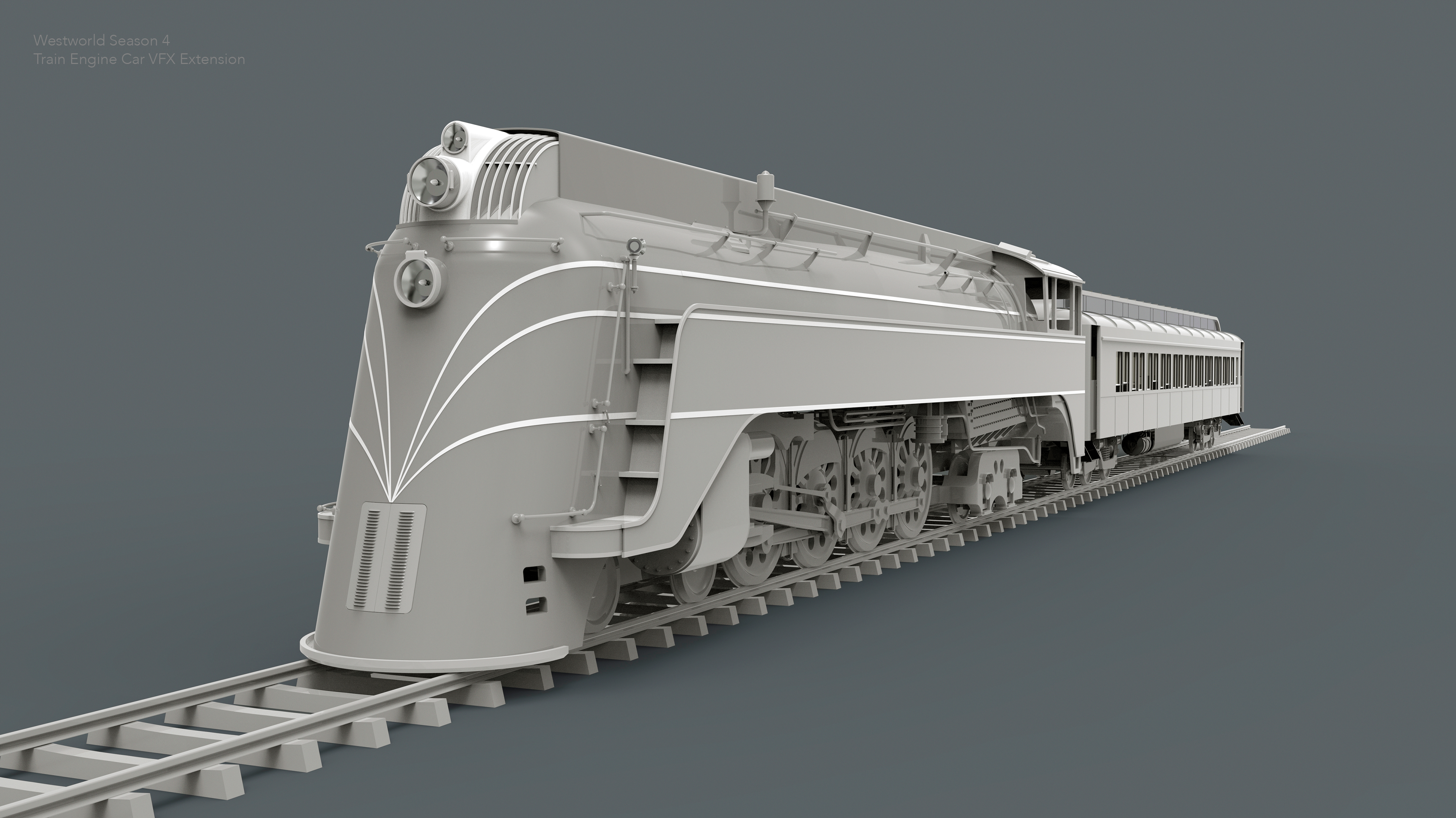
(Above) One of the key assets for Season 4 was the upgrade of the classic western locomotive to a steam engine car. The retro bullet train design was composited over the existing coal train engine. The render above showcases a proposed look for the train, incorporating the wheels from the locomotive available on location.
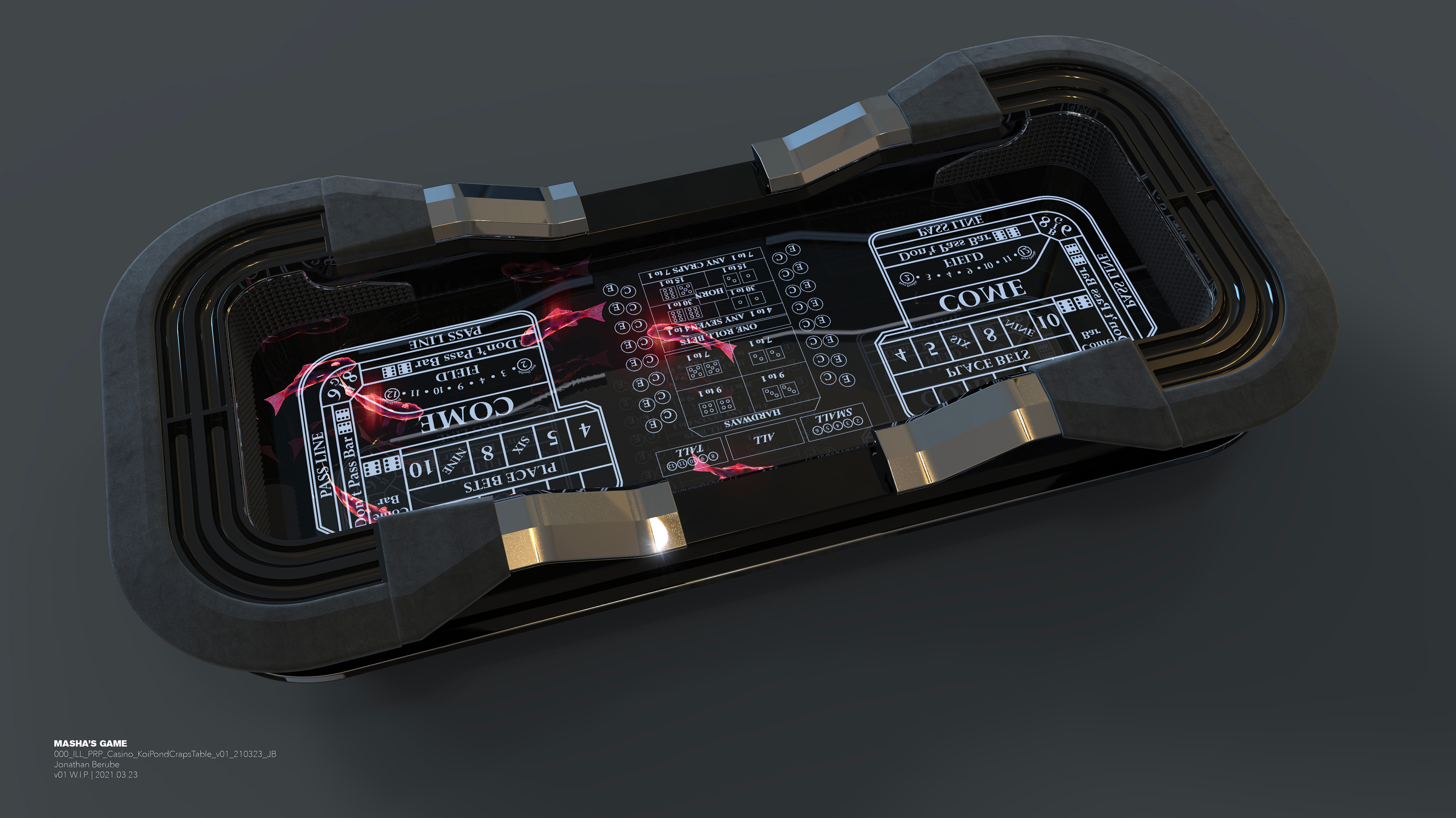
(Below) At one point, the script called for a casino scene featuring craps and poker tables. One of the enjoyable design challenges was to create an innovative, technologically advanced version of these tables while maintaining a sense of familiarity with their traditional design elements.
The craps tables, for instance, featured holographic koi ponds that rippled like real water whenever the dice hit the glass surface.would make contact with the table glass surface.
The craps tables, for instance, featured holographic koi ponds that rippled like real water whenever the dice hit the glass surface.would make contact with the table glass surface.




(Below) At one point, the script called for a casino scene featuring craps and poker tables. One of the enjoyable design challenges was to create an innovative, technologically advanced version of these tables while maintaining a sense of familiarity with their traditional design elements.


JONATHAN BERUBE
Creative Executive
Director + VFX Art Director
Episodics | Game Trailers | Commercials
Creative Executive
Director + VFX Art Director
Episodics | Game Trailers | Commercials